top of page
Crohn's & Colitis Foundation
Design of a product management tool

Crohn's & Colitis Foundation relied on manually tracking and managing projects. As the Foundation grew, this slowed teams down and placed a heavy cognitive load on the staff.
My Solution
I designed an internal project‑management tool that mirrored the team’s existing mental models, ensuring immediate adoption and a lighter cognitive burden.
MY ROLE
UX Designer
TARGET USER
Internal project managers & data analysts.
COLLABORATORS
Project managers & data analysts
TIMELINE
Jun 2023 - Mar 2024

Why this Approach?
The manual system had worked when the organization was small, but as project volume increased, it became overwhelming. The team needed automation without the friction of learning a new tool, so grounding the design in their familiar workflow made the most sense.
User Research Process
I carried out user interviews, workflow observation, and affinity mapping to build a clear understanding of how the internal teams at the Foundation worked.
This uncovered what they needed, where they struggled, and which habits were essential to preserve.
Together, these methods grounded my solution in their existing mental model, ensuring the new platform felt familiar, intuitive, and immediately usable.


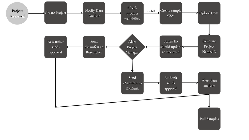
This figure shows the manual process the Foundation already had set in place. I had to rethink the workflow and make it come alive in my prototype.
Automated Work Flow Process

The integration of insights from the existing manual workflow and user research enabled me to design an automated process that streamlines operations effectively.
Some non-negotiables included:
1. Easy toggle between spreadsheets and emails
2. Automated alert system for various steps
3. Needed it to look similar to a spreadsheet
Lo-fi Wireframes


UI Design
The Homepage offers a high-level snapshot of all active projects, color-coded by status. Users can filter by priority or team, and see milestones at a glance.

.jpg)
The Project Request Page allows users to quickly submit new project requests by filling out a familiar, spreadsheet-style form.


The Project Overview Status shows a Kanban board method to track & move projects through stages. Projects are visually segmented by operational milestone, enabling at-a-glance status assessment. reducing cognitive load and supporting operational transparency.


Style Guide

Style guide to ensure design consistency and easier hand-off
Turning Insights into Design Principles
Intuitiveness through familiarity
Maintain structural elements from the existing workflow (like tables and status labels) so users wouldn’t need to relearn everything from scratch.
Efficiency through Automation
Introduce automated notifications and update systems to remove repetitive manual steps.
Visibility & Transparency
Build dashboards and views that clearly reflected real-time project statuses, owners, and required actions—no more guessing games.
Sustainable UX Design
Prioritize a clean, efficient interface that minimized cognitive load and was sustainable across devices (low energy use, high navigability).
User Feedback
Positive regarding familiarity, but users were concerned about "missing" the manual control of their old spreadsheets. Changes Made: I kept the "spreadsheet-style" form for project requests to lower the barrier to entry while automating the backend data entry. Client Feedback: Stakeholders emphasized the need for a "Color-Blind Friendly" system; I iterated on the status tags (New, In Review, Approved) to ensure they were accessible and functional, not just decorative
Next Steps
Feature Expansion: Automated Reporting: Based on early feedback, the next iteration will include a "One-Click Report" feature that automatically generates stakeholder updates, further reducing the need for manual email threads.
Advanced Accessibility Audit: While the initial version utilized an AI-generated color-blind friendly palette for status tags, I want to conduct a full WCAG 2.1 compliance audit to ensure the tool remains inclusive as the foundation grows.
bottom of page